 |
| TAMUC Garden |
Tuesday, November 11, 2014

Friday, November 7, 2014
Lenscratch Review
Lenscratch, E. Brady Robinson
http://lenscratch.com/2014/10/e-brady-robinson-art-desks/
 Image by Jennifer Schwartz
The website's layout is really easy to navigate with a nice menubar up at the top, and the newest article in full at the homepage. The logo is very creative reminiscent of the "Castle" TV show logo. it also utilizes a search bar that I have not had the pleasure to use.
I was drawn to the article because of the workspaces and how people arrange things and work with them to create beautiful pieces of art. It is also a reflection of the artists themselves. I think you can really get a sense of who these people are by what environment they work in.
http://lenscratch.com/2014/10/e-brady-robinson-art-desks/

The website's layout is really easy to navigate with a nice menubar up at the top, and the newest article in full at the homepage. The logo is very creative reminiscent of the "Castle" TV show logo. it also utilizes a search bar that I have not had the pleasure to use.
I was drawn to the article because of the workspaces and how people arrange things and work with them to create beautiful pieces of art. It is also a reflection of the artists themselves. I think you can really get a sense of who these people are by what environment they work in.
Feature Shoot Review
Feature Shoot, Ellyn Ruddick-Sunstein
http://www.featureshoot.com/2014/11/portraits-of-pit-masters-at-memphis-top-barbecue-hotspots/
 Image by Randy Harris
The Design is modern looking, but I was confused by how to look at the individual articles at first but I found out quickly enough. If you just scroll down and look at the images you will quickly pass up the link for the individual articles, so you have to keep an eye out for them. Otherwise, it's alright. It could be a little more obvious where links and site navigation is located. this seems to be the case with most websites these days, so whatever.
I like the images because they look rustic and down to earth. The people are relateable and homely. I love how the artist really captured the emotions and the sentiment that these people readily radiate from their bodies.
http://www.featureshoot.com/2014/11/portraits-of-pit-masters-at-memphis-top-barbecue-hotspots/

The Design is modern looking, but I was confused by how to look at the individual articles at first but I found out quickly enough. If you just scroll down and look at the images you will quickly pass up the link for the individual articles, so you have to keep an eye out for them. Otherwise, it's alright. It could be a little more obvious where links and site navigation is located. this seems to be the case with most websites these days, so whatever.
I like the images because they look rustic and down to earth. The people are relateable and homely. I love how the artist really captured the emotions and the sentiment that these people readily radiate from their bodies.
Glasstire Review
Glasstire, Bill Davenport
http://glasstire.com/2014/11/05/maker-faire/
 Image by Bill Davenport
Overall, the blog has a nice layout. The logo and the most current article is presented very well. getting to a recent, but previous article is not that hard either. simply scroll down, and there you go. the menu-bars are very well thought out in there placement. Obvious, but not so that it takes away from the image of the most current article, but actually leads your eyes right to it. I have to give it a thumbs up.
Maker Fair.
I was interested in the article simply because I love technology and what one can do with it if utilized effectively. The article was focused not on the things being made, but the makers doing the making. It really highlighted the vast ocean of people that actually love making stuff just for fun. I was interested in the article mainly because I love technology and what can be accomplished by it.
http://glasstire.com/2014/11/05/maker-faire/
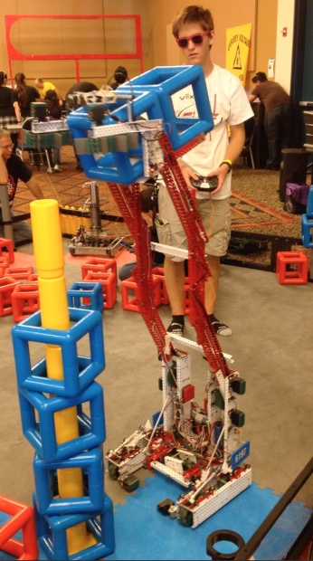
Overall, the blog has a nice layout. The logo and the most current article is presented very well. getting to a recent, but previous article is not that hard either. simply scroll down, and there you go. the menu-bars are very well thought out in there placement. Obvious, but not so that it takes away from the image of the most current article, but actually leads your eyes right to it. I have to give it a thumbs up.
Maker Fair.
I was interested in the article simply because I love technology and what one can do with it if utilized effectively. The article was focused not on the things being made, but the makers doing the making. It really highlighted the vast ocean of people that actually love making stuff just for fun. I was interested in the article mainly because I love technology and what can be accomplished by it.
Libby Rowe
As a whole, the whole gallery was filled with things that tell tales of rebuke, disdain, fear, and disapproval. While from a first glance, this gallery may seem like just any other modern art gallery, if you dig just a little bit, you will find that there is a whole world filled with undertones of failed expectations. The gloves were a perfect display of that. They represented the disapproval her mother had of her lifestyle choices and the molding her mother tried to put her though to find the "perfect man".
While the exterior of the displays may be girly or cute, look a little closer, and you will see that her mother and society has tried to push her through a cookie cutter to make her seem like a "normal woman". This idea can be seem with the balancing act that the audience may perform and the braiding and decoration of the hair. There is also a display that shows what is expected of a woman to be attractive and seductive. overall, the gallery is very well put together and the space provided has been utilized very well. nothing went to waste to prove a point.
While the exterior of the displays may be girly or cute, look a little closer, and you will see that her mother and society has tried to push her through a cookie cutter to make her seem like a "normal woman". This idea can be seem with the balancing act that the audience may perform and the braiding and decoration of the hair. There is also a display that shows what is expected of a woman to be attractive and seductive. overall, the gallery is very well put together and the space provided has been utilized very well. nothing went to waste to prove a point.
Week 11: November 7
 |
| Tiny Planet _ Class Demo - Fall 2014
Today in class, we talked about our Final Projects and went over the next assignment, Panoramas. Please go under "Assignments" for more details.
|
- If you have not received an invitation for the dropbox, please email me ASAP.
See you next week!
Final Project
Final Project: Self-Assigned Theme
 |
| Rachael Hildebrandt, Fall 2013 |
For this assignment, you will create a photographic project of your own choosing on a Single Theme. You will be working on this assignment throughout the duration of the semester. This should be a thoughtful investigation/exploration of something important to you or that you are interested in. Your photographic project will include 10 - 15 final images and will be printed and matted as a portfolio.
Timeline:
DUE Nov 14: Project Proposal
We will review and discuss your proposals in class.
1. This proposal should be between one paragraph long and one page long, but no longer than one page
2. You should address WHAT/WHY/HOW:
a. WHAT: the subject matter/topic you are interested in exploring
b. WHY: why you are interested in the topic, why it is significant
c. HOW: ideas of how you plan to visualize/investigate these ideas photographically
3. Print one copy of this proposal to turn in during class.
DUE Nov 21: Progress Critique
We will review your progress for the Final
1. 5 digital files for semester long project posted to your blog. Bring your files on a flash drive or hard drive to class
DUE Dec 5: Final Critique
All of your 10 -15 images must be posted on your blog
1. All of your final project files to uploaded to your blog
2. Prints matted for presentation
TBA: Intro to Digital Media Exhibition
Panorama
Friday, November 7: Landscape Panoramas & Introduction to Final Projects
 |
| Class Panorama from Fall 2013 |
Today we'll learn how to make Landscape Panoramas. Next week we will critique them. You need at least 2 Panoramas posted to dropbox by class time next friday, Nov 14.
TIP: Take the images for one pan and use all the different options available to you in the "photomerge window," as seen here.

Panoramas (the easy way):
Set your camera to fully manual settings. (manual focus, manual exposure).
Turn your camera horizontally. Take a series of images in an approximately 180 degree span, making sure to overlap your images by about 50%. Process them in Lightroom. (You may use lens correction to remove distortion), then export them to Photoshop.
In Photoshop, select the images and go to FILE> AUTOMATE> PHOTO MERGE. Select the files and hit OK. Once Photoshop merges the files, flatten them, make any additional adjustments and crop if needed.
Things to think about: Does the white background work for your image, or would it be better cropped? Does black and white add to the image or would it be stronger in color? How does your image stand up to the others? How many layers did you use? Which are best, and why?
http://www.hongkiat.com/blog/30-examples-tutorials-of-stunning-polar-panorama-photos/
 |
| Chuy Benitez |

 |
| George Küttinger |
 |
| Thinh Le, Courtyard |
 |
| Mark Klett, Panorama from Sentinel Dome, 2003 |


Lenscratch Review
Lenscratch is rather confusing but exhibits several artists and in interesting to the eye. It shows a variety of photographic styles. There are many more artists that you can look up and different genres of photography.

Laurel Golio
A photo essay illustrating the diversity and issues of the LGBT community's youth. Each photo portrays an individual and has a paragraph or two written by said individual. These kids go through so much and it's always interesting to hear their point of view. The artist did an amazing job of interviewing these kids and photographing them as they are.
http://lenscratch.com/2014/09/we-are-the-youth/
Thursday, November 6, 2014
Urbanautica Review
Urbanautica is the blog that I like least. Like featureshoot, it reads just like a facebook timeline, but the articles are all on the homepage. It gets harder to navigate and find articles of interest.

Jeffrey Wolin
The article illustrated the use of text or writing in addition to a photograph. It was his main thesis during his education. He sought inspiration from other artists and started creating his own masterpieces. The article was basically a memoir of his life and how he worked to make the images and ideas his own.
http://www.urbanautica.com/post/101659505024/portraying-memory-photographs-with-a-text
Aperture Review
Aperture was basic and lacked too much detail that would distract the viewer from the articles. It was pleasant and very "to the point".

Paul Strand
This article read mainly about his exhibition and the meanings behind his subject. The photo from this article is what caught my eye. I love the contrast and the detail in her hands. It shows age and possibly experience (arthritic fingers from years of use). I admire the ability to capture age and allow it to be graceful in its own way.
http://www.aperture.org/exhibition/paul-strand-hazel-strand/
NY Times Review
Small icons and lack of a search bar makes things a bit more difficult for a view of the NY Times blog. It was a little frustrating to say the least, but each article reads easier than the home page.

David Redfearn
Photographer to many of the classic musicians that we know of today, passed away last month. I'd known that name and some photos that were taken by him but I was unaware that he was still shooting as recently as 2000. The man knew how to capture photos of his famous subjects in action and create these iconic images that we are used to seeing. His portraits are in no way formal but allow us to see the usual subjects in a different light.
http://www.nytimes.com/2014/11/07/arts/design/david-redfern-british-photographer-of-jazz-and-pop-dies-at-78.html?ref=design&_r=0#
Featureshoot Review
Featureshoot.com is easier to browse and meander through than most of the other blogs in my opinion. I believe it's because it reads like a facebook timeline where all you do is scroll unless you want to search for something in specific. Most of the articles contain multiple images from the artist's series which I find easier to compare and contrast and see more meaning behind what the artist was using as their point.

http://www.featureshoot.com/2014/11/captivating-portraits-of-a-fashionable-homeless-man-in-his-many-improvised-outfits/
Yurko Dyachyshyn
The photographer used one subject throughout his series, a homeless man in Ukraine. He gets personal with his subject is even described as a friend to the homeless man, Slavik. The man dresses differently everyday and styles his hair and beard just before emerging into the city to greet the world requesting spare change. This was interesting to me mainly because I have been involved with and have viewed many photos with homeless subjects. Never have I seen a series that only used one man for many days to illustrate the artist's view, but I guess Slavik's case is more unique than most.
http://www.featureshoot.com/2014/11/captivating-portraits-of-a-fashionable-homeless-man-in-his-many-improvised-outfits/
Glasstire Review
To be honest, it was a bit disappointing to click on a link and be taken to an empty page, apologizing for the page being under construction. It's a simple looking blog, but it is hard to find certain things if you know what you may be looking for.

Pieter Hugo
His photos, yet aesthetically pleasing, send an eerie vibe to his viewers. The portraits are staged and usually involve a stereotypical slasher/killer/creep in the middle of New Orleans. He captured the horror and titillating violence that are often associated with the city because of the history.
http://glasstire.com/2014/11/06/five-reasons-to-go-to-prospect-3-new-orleans/
Libby Rowe Exhibition
Learning Feminine: Sister by Libby Rowe was a piece that included 9 frames filled with a gelatin base, containing several strands of hair in the form of a ponytail. Beneath were a few glass dishes holding various hair accessories to style the hair pieces with. Now many of the art exhibits that I've been to discourage touching the art or even getting too close to it. This exhibit differs greatly as the art doesn't exist without the audience participation. We as audience members are encouraged to pick up a barrette and style the hair however we choose. I am even more so intrigued that the piece will never look exactly the same as before. Each person who walks past can experience the act of braiding or styling hair and are encouraged to mock this age old feminist practice with a friend having pleasant conversation about their day. Her idea of the connotation of "feminine" is right in tune with this piece. It mimics what we do every time we go to the salon to get our hair styled. It reminds me of playing dress up and getting to braid my sister's hair just for fun. We tend to lose sight of how we are socialized to be feminine when we get older, but in a way this hits close to home.
Urbanautica- Alla Mirovskaya
http://www.urbanautica.com/post/77369880318/phototalks-with-alla-mirovskaya
 Urbanautica's site was very confusing and it took me forever to navigate myself to an article. At first it seems very classy and well put together but in all honesty its a little everywhere.
Mirovskaya is a very personal artist. The moments she captures are very mysterious and deep, creating the illusion of a story with so many hidden truths. I know that may be odd to read, but that is what comes to mind . So far, although the site gave me some trouble, this is my favorite photographer.
http://www.urbanautica.com/post/77369880318/phototalks-with-alla-mirovskaya

Mirovskaya is a very personal artist. The moments she captures are very mysterious and deep, creating the illusion of a story with so many hidden truths. I know that may be odd to read, but that is what comes to mind . So far, although the site gave me some trouble, this is my favorite photographer.
APERTURE-Richard Avedon
 Aperture's blog is a little confusing to me because every time I move my mouse, something pops up. Otherwise, I like the color scheme and how it is put together.
Avedon's photos are exemplary. I am absolutely in love with the photo above. The way Avedon captured the movement of the model and dress is amazing and beautiful. Whether a wind is pushing her or landing from flight, the suspended feel the photo has is very intriguing.

Avedon's photos are exemplary. I am absolutely in love with the photo above. The way Avedon captured the movement of the model and dress is amazing and beautiful. Whether a wind is pushing her or landing from flight, the suspended feel the photo has is very intriguing.
Wednesday, November 5, 2014
Review: Aperture
Inez & Vinoodh

Annie Leibovitz
The layout of the blog Aperture is modern and basic. The articles are
all in the same page. All one has to do is scroll down. I like the background
because it is light and dark gray. It makes the blog look professional and
gives a feeling that the webpage I am in is of art. The title tells me without
even looking at the rest of the article, that there are going to be numerous
photographers. The reason being is that the title says, "The Icons."
Inez & Vinoodh brought together many unique photographers like the one
above. Annie Leibovitz portrays in her shot, a woman that is masculine and
independent. She is a woman who doesn't need someone to depend on. She has her
boots on and ready to work. It looks like she might ride horses. Women are not
usually portrayed as riding horses because it's a man's sport. I think this
woman has great strength that many woman do not appear to have when they are
shot in other pictures. Women are usually seen as innocent and pure.
Review: New York Times
Jeffrey Bernett

Jeffrey Bernett
Chang W. Lee
The New York Times has a section for Art and Design but it doesn't have any tabs that can help the reader find articles that they might find interesting. All the articles are scattered with no search bar or categories. The layout is funky because there are articles everywhere. There is no reason for many articles in the front page. The photographer, Chang W. Lee is illustrating the work of Jeffrey Bernett. Jeffrey Bernet is a product designer that designs beds and sofa. Basically, the most important items that are essential in a house/ apartment. I find his preference of designing beds to be interesting because beds are a place that someone goes to at the end of the day. Whether the person is having a good or bad day, at the end of everything, sleeping in one's bed is and should be the most comforting places to be at. He try's to make his art/design with good material that can with stand many years. Dan Rubinstein includes in his article that Bernett makes beds that are a place where one should be comfortable and modern.
Subscribe to:
Posts (Atom)